After several months of preparation, the city of St. Joseph has unveiled its new-look website in hopes of creating an easier-to-use experience for residents and visitors. The announcement of the new website came during Monday’s regular city commission meeting, and was scheduled to go live at 4 p.m Tuesday.
In a memo to commissioners, Community Development Director Kristen Gundersen laid out a list of improvements found on the site. Among the noticeable differences, according to the memo, are a cleaner-looking design which will be easier to use on mobile phones and computers. It will also be easier to maintain, according to the memo.

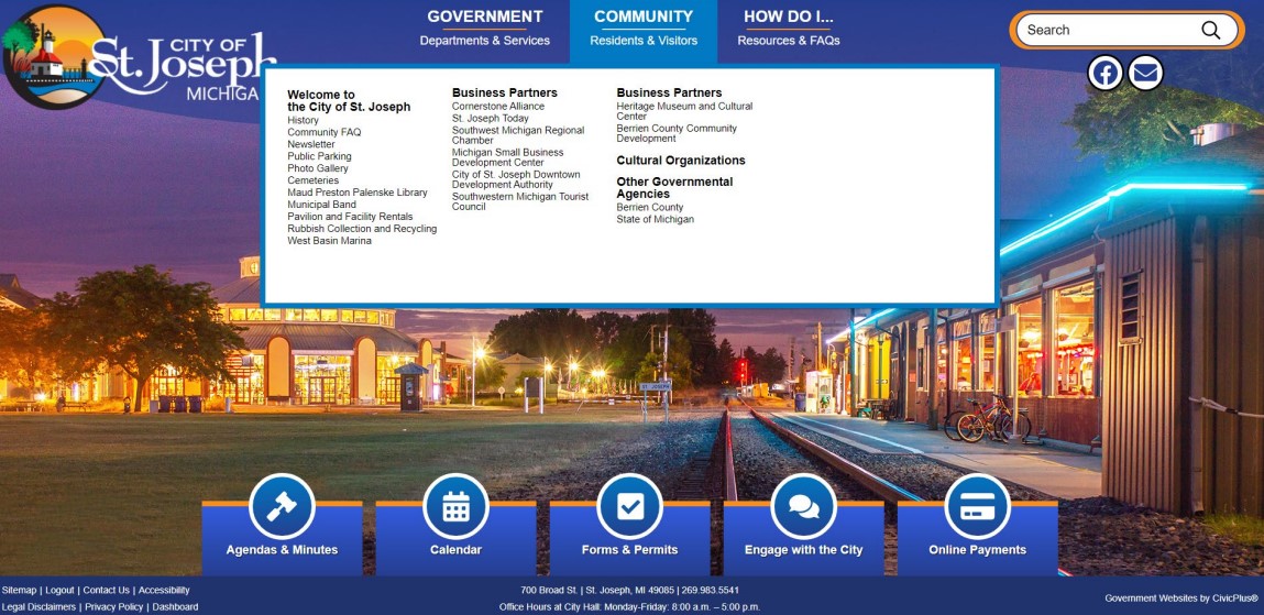
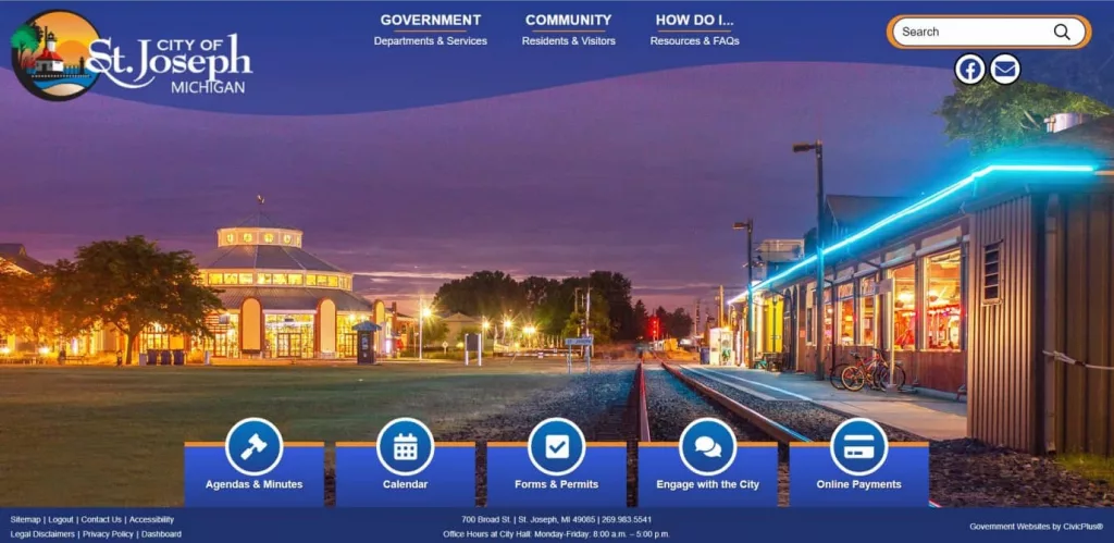
There is no scrolling needed on the new main page, which features a consolidated top menu and five new buttons for direct access to information.
City news can be found scrolling across the top of the main page, with a function that allows the city to place an emergency header on the page if necessary. Meeting agenda links also will be available via the main page of the site.
Other features, according to the memo from Gundersen, are:
- A designated place for posting of Bids and RFPs and another designated place for Job Openings.
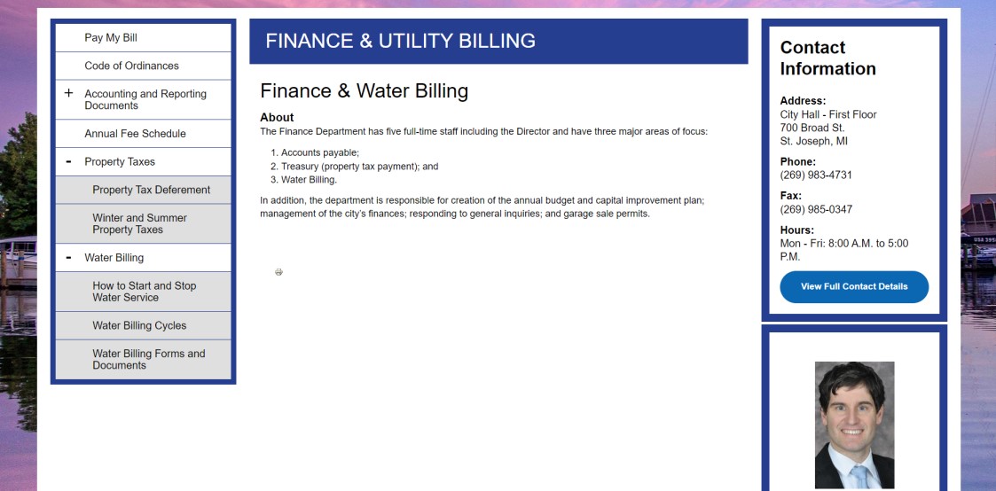
- Forms, Permits and Applications are found in one location and can be searched by department or board/commission. In addition, similar type permits are located together under one heading.
- Many forms were updated to create a cohesive look for the individual department and are .pdf fillable.
- Where information is found on several individual webpages, it now only needs to be updated in one location which will decrease the possibility of having outdated legacy information left on a portion of the website.
- A predetermined font type and size – user cannot change, which will help maintain a uniform appearance.

The website’s URL will stay the same. See the changes for yourself at sjcity.com
(Screenshots courtesy City of St. Joseph)


